The value of visualising big, public sector data
Visualisation unlocks insight in otherwise impenetrable data.
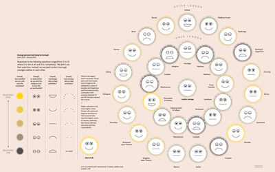
How happy are different parts of London?
Portrayal of data on happiness in each of London’s boroughs1
Beyond just presenting a summary of data, today’s visualisation tools allow the user to drill-down; “zoom in”, specify and refine your query. Further, modelling combines with visualisation to create “what-if” dashboards.
 |
 |
|
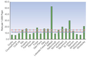
Crime in different areas of Leicester 2 |
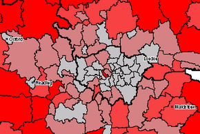
Proportion of older citizens in and around London3 |
Visualisation allows your data to “speak” what it needs to tell you, but that communication can be two-way; allowing your questions the visualisation prompts to be answered. Leading analytics tools, e.g. IBM Cognos and SAP BusinessObjects supply visualisations that answer queries based on your organisation’s data on demand. These solutions can be enhanced with predictive analytics technology; IBM SPSS or SAP InfiniteInsight; which identifies patterns in large data sets and on these bases predicts trends and threats based on current and future factors.
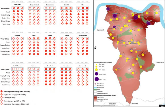
Further breakdown of crime in Leicester and ‘Southwark Atlas of Health’4
For advice on which tooling would best suit your organisation’s budgets and goals, please contact us.
Contact us
t: 0207 337 6136
e: contact@influentialsoftware.com
w: https://www.influentialsoftware.com
Endnotes
1. “Islington has issues” chart; The Information Capital
2. Case Studies, Improving Data Vizualisation for the Public Sector
3. Ibid.
4. Ibid.